In 2025, business cards remain a valuable tool for networking and personal branding. Even with digital alternatives, nothing replaces the impact of handing someone a physical card. For professionals, entrepreneurs, and creatives, a business card is more than contact information; it represents your personality, your professionalism, and your brand identity.
Design plays a huge role in making that first impression unforgettable. A sleek layout can show confidence and credibility, while a bold, creative design can spark curiosity and conversation. In this guide, you’ll find practical and modern business card ideas that help you stand out, connect authentically, and leave a lasting impression.
Showcase Yourself, Your Brand, or Your Business
A business card is more than just a small piece of paper; it is a powerful tool to showcase who you are and what you stand for. In 2025, branding plays an even greater role in building trust and making lasting connections. Your business card should reflect your identity, whether you are an entrepreneur, a freelancer, or a corporate professional. Adding your logo, tagline, or unique value proposition helps others instantly understand your purpose and remember your business.
When creating a business card, it’s important to keep brand consistency in mind. The colors, fonts, and tone should align with the image you want to project. For example, a law firm might prefer strong, traditional designs, while a creative freelancer may use vibrant visuals to stand out. A business card acts as a mini representation of your entire brand, and when designed with clarity, it becomes a conversation starter. Adding personal touches like a mission statement or social media handles can also make your card more engaging.
By focusing on brand alignment, your business card becomes more than contact information; it becomes a marketing tool. It tells people about your professionalism, your creativity, and your vision. Whether through sleek graphics or bold taglines, a well-designed business card ensures that the first impression of your brand is memorable and impactful.
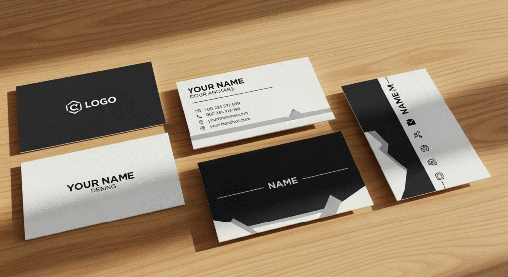
Take a Sleek and Professional Approach
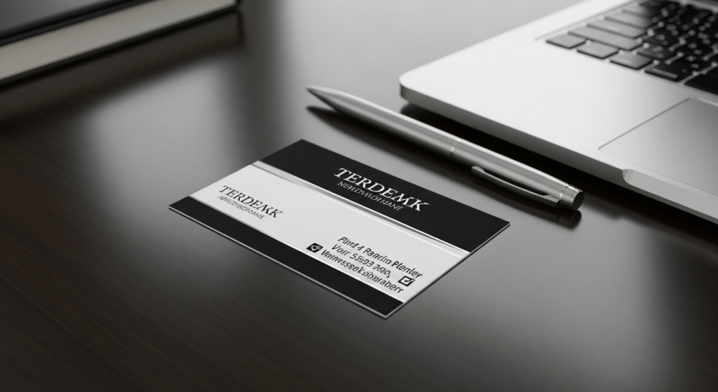
A sleek and professional business card never goes out of style. This type of design is perfect for individuals working in corporate environments, finance, law, consulting, or any industry where professionalism is a top priority. The focus here is on clean lines, neutral tones, and subtle elegance that communicate credibility. A business card like this signals seriousness and reliability, which are qualities clients and partners value.
When designing a sleek business card, simplicity is key. Avoid overcrowding with unnecessary graphics or text. Instead, use legible fonts, plenty of white space, and a structured layout. Premium finishes like matte lamination, embossed text, or metallic accents can add sophistication without being overwhelming. These subtle design choices make your business card feel high-end while staying professional.
Neutral color palettes such as black, gray, navy, or white add to the professional appearance. These shades give your business card a timeless quality that works in both casual and formal interactions. Including only the most important details, your name, position, contact information, and company logo ensures clarity and avoids distraction.
Go for a Fun, Creative Approach
Not all industries require formality; sometimes, creativity is the best way to make your mark. A fun and creative business card is perfect for artists, designers, startup founders, or professionals in media and entertainment. Bright colors, playful fonts, and bold graphics can make your business card stand out and reflect your personality. In a competitive market, such designs help spark conversations and leave a lasting memory.
When creating a creative business card, think outside the box. You could experiment with shapes, textures, or even interactive designs that surprise people. For example, a graphic designer might use a colorful gradient background, while a photographer could include an artistic snapshot as part of the card’s design. Adding elements of humor or personal creativity can also make your business card more approachable and relatable.
Colors and typography play a major role in this type of business card. Vibrant shades like red, orange, or teal can grab attention instantly. Fun fonts or handwritten styles can add personality without sacrificing readability. These design choices reflect originality and innovation, qualities that appeal to clients in creative industries.
A creative business card tells others that you are imaginative, bold, and unafraid to stand out. It serves as a mini portfolio, hinting at your unique style and approach. Instead of being tossed aside, a fun business card is more likely to be remembered and shared, helping you build stronger connections.
Use Full-Page Imagery
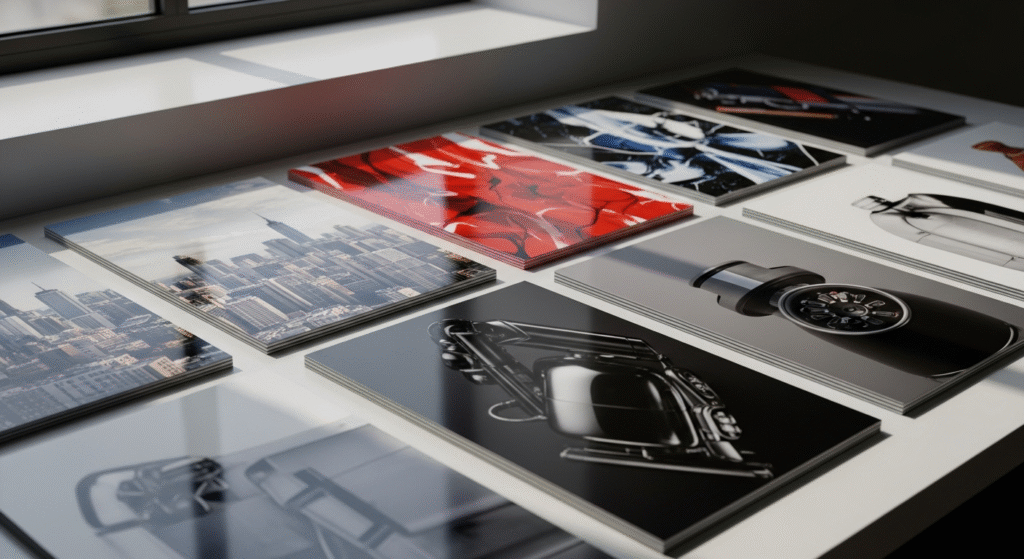
A full-page imagery business card is one of the most eye-catching design options available today. This style uses visuals that cover the entire surface of the card, transforming it into a small piece of art. It works exceptionally well for photographers, travel agents, real estate agents, and artists who want to showcase their work directly on the card. By using a striking photo or visual, the business card itself becomes a portfolio piece.
When designing a full-page imagery business card, the quality of the image is crucial. High-resolution visuals ensure clarity and professionalism. The imagery should also be relevant to your business; photographers may feature a sample of their best shot, while a travel consultant might use a scenic landscape to inspire adventure. These visuals quickly communicate your services without the need for extra words.
Balance is important when working with imagery. While the picture should be prominent, the text must remain legible. This can be achieved by using contrasting text colors, overlays, or placing information strategically in a corner or on the reverse side of the card. Combining beautiful imagery with essential contact details ensures that the card remains functional while being visually appealing.
A full-page imagery business card makes a bold statement: you are confident in your work and ready to showcase it. This style ensures that people remember your card not only as contact information but as an artistic expression of your brand. In 2025, when visuals dominate marketing, this type of business card is a powerful way to grab attention and leave a lasting impression.
Make a Photo Collage
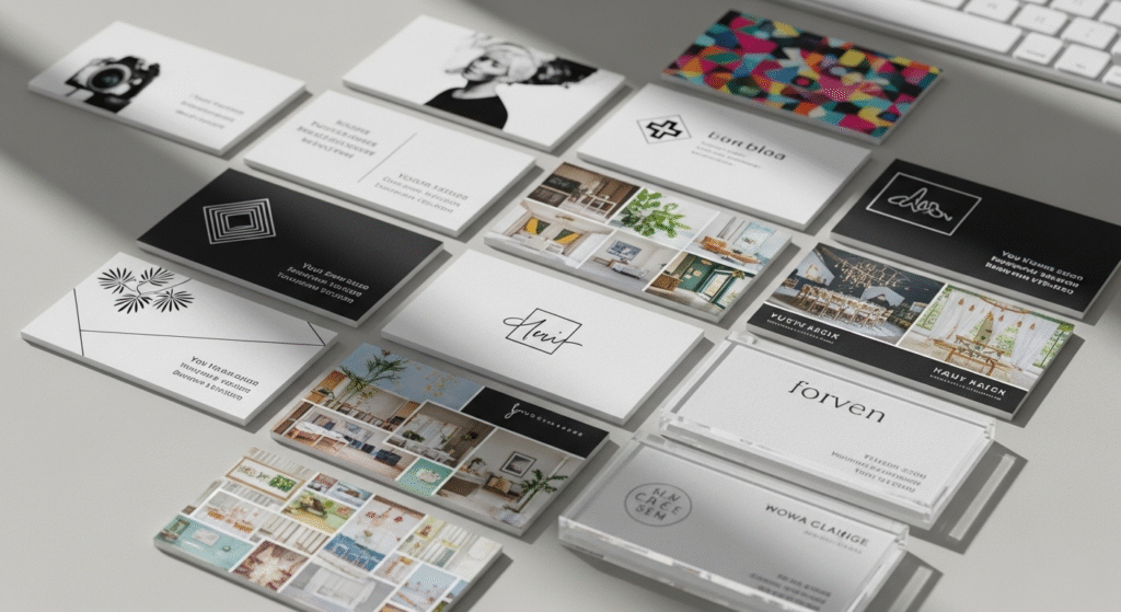
When designing a collage, balance and clarity are key. Too many images can make the card look cluttered, so it’s important to choose three to five strong visuals that complement each other. For example, a wedding planner could include photos of flowers, decorations, and happy couples, while a bakery owner could feature images of cakes, pastries, and coffee. By carefully selecting photos, your business card becomes a miniature portfolio in the hands of potential clients.
It’s also important to maintain readability. Your contact details, logo, and name should still stand out even with multiple images on the card. This can be achieved by using transparent overlays, framing techniques, or placing text on the reverse side of the card. High-resolution images are essential, as low-quality pictures may harm the professional look of your business card.
A photo collage business card shows creativity, energy, and a passion for your craft. It allows you to share more of your work in a compact format while still being functional. In industries where visuals matter, a collage-style card helps potential clients instantly recognize your skills. It’s more than just a card; it’s a small, portable showcase of what you offer.
Feature a Photo of Your Craft

Featuring a photo of your craft on a business card is a powerful way to demonstrate your expertise. Instead of relying on text alone, you let your work speak for itself. For example, a baker could display a picture of a beautifully decorated cake, an artist might show a piece of their painting, and a woodworker could highlight a unique handmade item. This type of business card immediately connects your skills to your brand, making it easy for others to remember what you do.
One of the biggest benefits of using a photo of your craft is authenticity. Potential clients can see the quality of your work at a glance. It creates trust because people feel more confident when they see actual results. In creative industries, this visual proof can be the deciding factor that sets you apart from competitors. By showcasing your work on your business card, you provide a direct sample of your abilities without needing a portfolio in hand.
When designing this type of card, it’s important to use a clean layout. The photo should take center stage, while your name, logo, and contact details remain easy to find. Avoid overcrowding with too many design elements that distract from the main image. High-quality, professionally captured photos are a must because a blurry or poorly lit picture could hurt the impression you want to create.
A business card that features your craft is both practical and inspiring. It acts as a mini advertisement, reminding clients of your unique offerings every time they look at it. By blending your creativity with functional contact details, you create a card that people won’t easily forget.
Show Off Your Self-Portrait

Including a self-portrait or professional photo on your business card is a bold yet highly effective design choice. In today’s digital age, faces are often easier to remember than names. A business card with your picture ensures that people can connect your name to your face instantly, making it harder for them to forget you after a meeting. This approach is particularly useful for real estate agents, coaches, consultants, and freelancers who thrive on personal branding.
A self-portrait adds a personal touch to your business card. Instead of being just another card in the pile, it becomes a reminder of your presence. This helps in building trust and familiarity, especially when networking or meeting potential clients for the first time. A smiling, professional portrait communicates warmth and approachability, encouraging people to reach out.
When creating a self-portrait business card, it’s essential to choose the right photo. It should be high-resolution, professionally taken, and reflect the image you want to project. For corporate roles, a formal headshot is ideal, while creative professionals may prefer casual, stylish photos that highlight personality. The placement of the portrait also matters, keeping it balanced with text and design ensures the card looks polished.
Adding your photo doesn’t mean sacrificing professionalism. With the right layout, a self-portrait can blend seamlessly with modern design elements. Combined with your name, title, and contact details, it makes the card both memorable and useful.
A self-portrait business card is perfect for professionals who want to stand out in personal branding. It transforms a simple card into a recognizable, trustworthy, and memorable tool for networking.
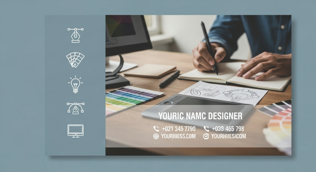
Use Icons for Imagery That Presents Your Business
Icons are a powerful yet simple way to communicate what your business is about. Instead of relying on heavy graphics or large photos, you can use small, meaningful icons to represent your services or products. For example, a café owner might use icons of coffee cups or pastries, while a digital marketer could use symbols of graphs, laptops, or chat bubbles. A business card with icons gives a modern and minimalistic feel while still delivering clear information.
One of the best things about using icons is flexibility. Icons can be combined with text or used as decorative elements to guide the reader’s eye. They make the card visually appealing without overcrowding the space. In 2025, minimal design is highly popular, and icons fit perfectly into this trend. A business card with clean icons shows professionalism while keeping a creative edge.
When designing with icons, it’s important to ensure they align with your brand. Consistency in style, size, and color helps create a polished look. Overusing icons can make the business card look busy, so it’s best to select only a few that truly represent your services. For example, a fitness trainer may use icons of weights and running shoes, while a travel agent could include icons of planes and maps.
Icons are also highly adaptable for digital design tools, making them easy to customize. Whether flat, outlined, or colorful, the right icons can instantly communicate your message.
A business card with icons provides a balance between simplicity and creativity. It makes your services easy to understand at a glance, helping clients quickly connect your name to what you offer. It’s an excellent choice for modern professionals who value clarity and visual appeal.
Combine Icons and Imagery to Match Your Offerings
A unique way to make your business card stand out is by combining icons with imagery. While icons provide a clean and modern representation of your services, real images showcase authenticity and detail. When used together, they create balance, professional yet creative. For example, a photography business card could feature a camera icon alongside a real photo of their work. Similarly, a bakery could use cake icons with an image of a delicious pastry. This combination makes the design visually rich while still easy to understand.
The key to success lies in harmony. Too many icons or oversized images can overwhelm the layout. To avoid clutter, keep icons simple and complement them with a single strong image. This ensures the business card remains professional while still being eye-catching. Icons act as visual shorthand, while images offer depth and context, helping potential clients instantly recognize your expertise.
This approach works especially well for businesses that want to showcase both creativity and credibility. For example, startups, creative agencies, or freelancers can highlight their services in a way that looks modern but not overwhelming. A carefully balanced design shows thoughtfulness and attention to detail, which clients will appreciate.
By combining icons and imagery, you can create a business card that speaks clearly about your brand identity. It’s not just about sharing contact details, it’s about visually communicating your services and values. This design strategy ensures your business card is both memorable and effective, giving you an edge in today’s competitive market.
Choose Fonts That Make a Statement
Fonts play a bigger role in business card design than most people realize. Typography is not just about readability, it’s about personality. The type of font you choose reflects your brand identity and can influence how people perceive you. Bold, modern fonts work well for startups and tech companies, while elegant serif fonts communicate luxury and tradition for high-end brands like law firms or fashion designers. Your business card should instantly communicate who you are, and fonts make that possible.
A clear and well-chosen font ensures that your contact details are easy to read, even at a glance. Overly decorative or tiny fonts can confuse the reader and ruin the professional look. On the other hand, unique typography can make your business card stand out from the crowd. Pairing fonts is also a great design strategy; using one font for your name and another for supporting details can create visual hierarchy and balance.
When selecting fonts, think about tone and context. A handwritten-style font might work beautifully for a wedding planner but would feel out of place for a financial consultant. Likewise, a bold sans-serif font fits perfectly for a modern startup but may not reflect the elegance needed for luxury branding.
Choosing fonts that make a statement transforms your business card into more than just a tool for sharing contact details, it becomes a reflection of your values and professionalism. By paying attention to typography, you ensure your card is both stylish and functional, leaving a lasting impression.
Make a Statement with Your Name
When designing a business card, your name should always stand out. After all, it’s the most personal part of the card and the detail people will remember most. A strong, well-placed name can make your business card instantly recognizable and give it a professional edge. Instead of blending into the background, your name should be one of the first elements that catches the eye.
There are many ways to highlight your name on a business card. Increasing the font size is a simple method, but you can also use bold text, unique typography, or even color contrast to make it pop. Some people choose embossing or foil stamping to give their name texture, ensuring it feels as good as it looks. No matter which option you choose, the goal is to ensure your name doesn’t get lost among other details.
Placing your name strategically is also important. While most business cards position names in the center or upper left, experimenting with placement can make the card unique. For example, vertical cards might feature names running along one side, creating a bold and modern look.
Highlighting your name is not just about vanity; it reinforces personal branding. Clients and colleagues want to connect with a person, not just a company. A memorable name presentation ensures that your business card becomes more than just contact information; it becomes a reminder of you.
By giving your name the attention it deserves, your business card leaves a strong impression. Whether you go for simplicity or luxury, making your name the focal point helps people remember you long after the initial meeting.
Experiment with Horizontal and Vertical Layouts
Most people are used to seeing business cards in a standard horizontal format. While this works well, experimenting with vertical layouts can make your card stand out from the pile. The choice between horizontal and vertical depends on the impression you want to create and the type of information you need to include.
A horizontal business card offers more space for text and images, making it ideal for professionals who need to share detailed information. It’s also the traditional choice, so it communicates reliability and professionalism. On the other hand, vertical business cards feel fresh and modern, often used by creatives, designers, or anyone who wants to break away from convention.
Design flexibility is another benefit of vertical layouts. They allow for unique placements of logos, names, and icons, making the business card more memorable. However, they may not always fit neatly in standard cardholders or wallets, so it’s worth considering how your audience will store them.
No matter which layout you choose, clarity should be the priority. A vertical design should not sacrifice readability, and a horizontal design should not look boring. Mixing creativity with practicality ensures your business card looks professional and functional.
By experimenting with both layouts, you can choose one that best reflects your brand identity. Whether sleek and traditional or bold and unconventional, the layout of your business card plays an essential role in how people remember you. A thoughtful choice here can set you apart in any networking situation.
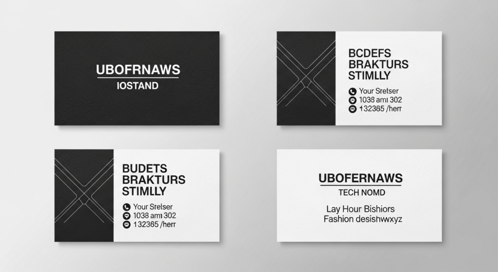
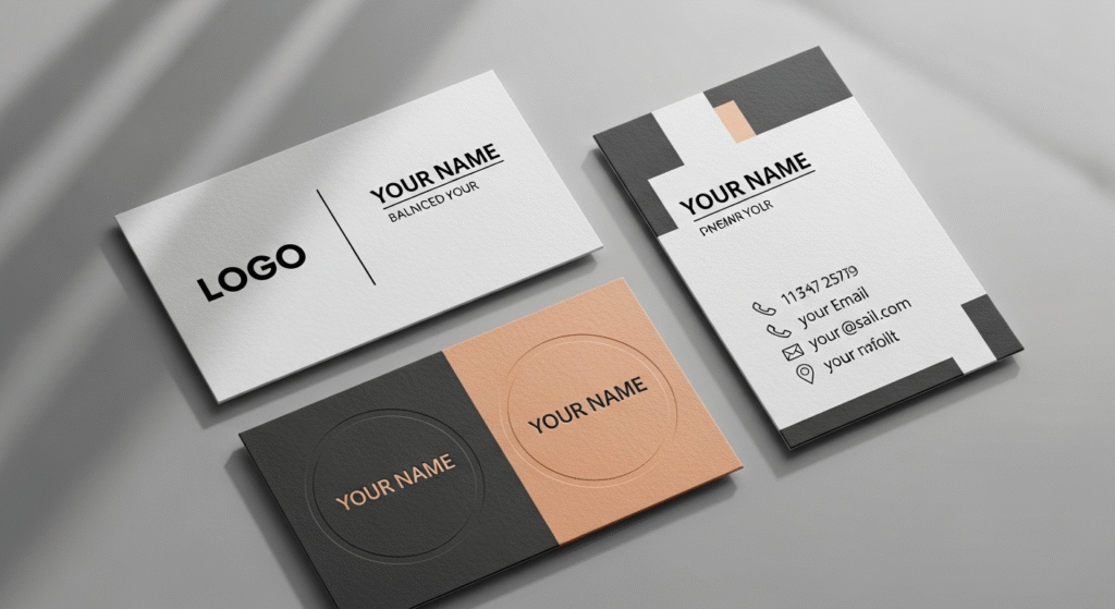
Keep It Simple with Your Color Choices
Color is one of the most powerful design elements on a business card. However, using too many shades or loud combinations can make the design look unprofessional. Simplicity often creates elegance, allowing your message to shine without distraction. A clean color palette communicates confidence, while cluttered colors may confuse or overwhelm the reader.
Neutral tones like black, white, navy, and gray remain classic choices for business cards. They convey professionalism and are versatile across industries. Adding a single accent color, such as gold, red, or teal, can bring personality without losing sophistication. This balance keeps the design visually appealing while ensuring readability.
It’s also important to consider brand alignment. Your business card should reflect your logo and overall branding, so the colors need to match or complement your existing palette. This creates consistency across your materials, from websites to presentations.
Simplicity does not mean boring. A two-tone business card or one with subtle gradients can look modern and stylish while still being easy on the eyes. High contrast, like white text on a dark background, also ensures details are clear.
By keeping your colors simple, you make the content of your business card stand out. A thoughtful color scheme communicates professionalism, attention to detail, and trustworthiness. In networking situations, these qualities are invaluable.
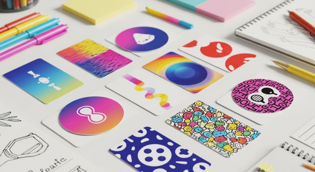
Experiment with Creative Color Combinations
While simplicity has its benefits, creative color combinations can also make a business card unforgettable. Using bold and unexpected colors shows confidence and creativity, especially if you work in industries like fashion, design, or media. The right mix of colors can capture attention and spark conversations.
Bright color schemes like turquoise and coral, or bold contrasts like black and neon green, give your business card an energetic look. Gradients and multicolor patterns are also popular in 2025, providing a modern, eye-catching effect. The key is to use creativity without overwhelming the design.
Balancing vibrant colors with neutral shades ensures that text remains easy to read. For example, pairing a bright background with white or black fonts keeps the information clear. Icons and logos can also use bold colors, while the rest of the card remains simple.
Another benefit of creative colors is brand distinction. If your competitors use traditional tones, a colorful business card helps you stand out instantly. It communicates originality and makes people more likely to remember your brand.
Creative color choices should still align with your business identity. A law firm might not suit neon colors, but a creative agency could thrive with them. Matching industry expectations with originality ensures your design makes sense.
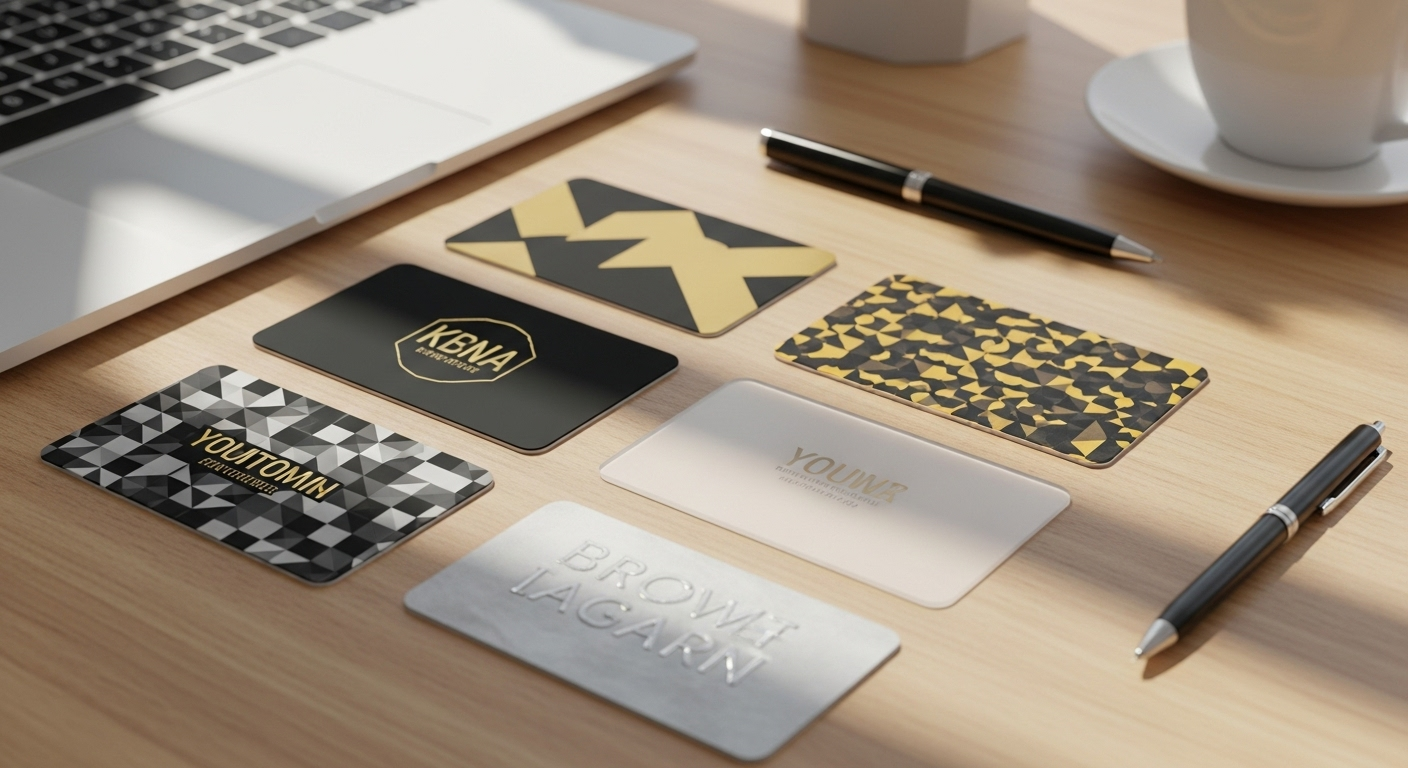
Choose the Right Materials for Your Business Card
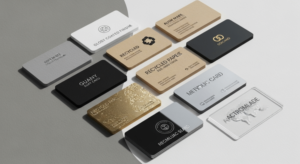
When it comes to designing a business card, the material is just as important as the design itself. The feel of the card in someone’s hand can influence how they perceive you and your brand. A thick, high-quality paper stock immediately signals professionalism and reliability, while a flimsy card can give the opposite impression. In 2025, businesses are focusing not just on looks but also on the tactile experience their business card provides.
There are many material options to consider. Premium paper with textured finishes such as linen, cotton, or recycled fibers can add sophistication. Eco-friendly materials are also becoming increasingly popular as more professionals aim to reflect sustainability in their branding. For a sleek, modern vibe, plastic or metal business cards are also excellent options, though they are more expensive. Each choice of material adds a unique feel to the business card, helping it stand out from standard prints.
Durability is another important factor. A well-made business card lasts longer in someone’s wallet, ensuring your contact details stay visible. The choice of material also influences how well special finishes like embossing or foil stamping can be applied. Choosing the right material is not just about aesthetics; it’s about practicality and long-term impact.
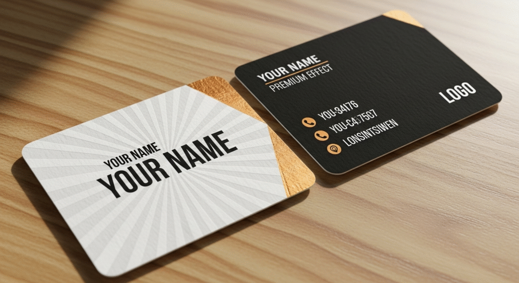
Experiment with Special Finishes
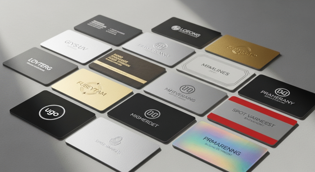
Special finishes can turn a simple business card into a premium branding tool. Techniques like embossing, foil stamping, and spot UV coating add depth and texture, making your card not only look attractive but also feel unique in someone’s hand. Matte and glossy finishes also play a big role in perception—matte for a modern, subtle touch and glossy for a vibrant, polished effect. These finishes help your business card communicate quality, professionalism, and creativity.
Embossing and debossing create raised or pressed textures that highlight logos or names. Foil stamping, on the other hand, adds a metallic shine that feels luxurious and works well for premium brands like jewelry, fashion, or consulting services. Spot UV can highlight specific parts of the design, such as your logo or tagline, making them pop against a matte background. These details may seem small but they create a powerful impact when networking.
While special finishes add sophistication, balance is crucial. Overusing effects can make the card appear cluttered or overwhelming. Instead, focus on one or two features that align with your brand identity. For example, a law firm might opt for matte with embossed lettering, while a creative agency might use bold foil stamping.
Experimenting with finishes shows that you care about presentation, and that extra effort leaves a lasting impression. A business card with unique textures and visual appeal is more likely to be kept rather than tossed aside. By using special finishes strategically, you turn your card into a miniature branding statement that clients will remember.
Sustainability in Business Cards
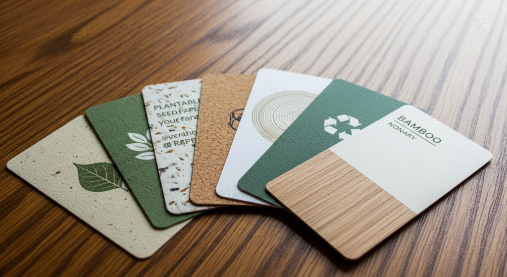
In 2025, sustainability plays an important role in how businesses present themselves, and your business card is no exception. Many companies are moving away from traditional printing methods and exploring eco-friendly alternatives. Using recycled paper, soy-based or water-based inks, and biodegradable finishes helps reduce environmental impact while also showing clients that you care about the planet.
Another growing trend is using eco-friendly materials like kraft paper or plantable seed paper. With seed paper, your business card can actually grow into a plant after being planted in soil. This not only minimizes waste but also creates a unique and memorable experience for the recipient. Choosing eco-friendly options makes your business card stand out while promoting sustainability.
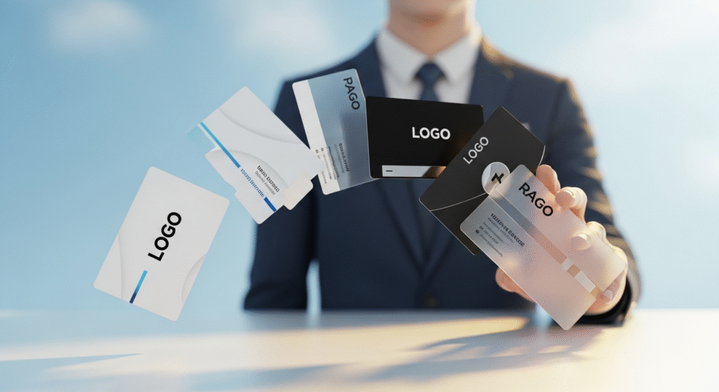
Some professionals are also switching to digital business cards. These virtual alternatives can be shared instantly through QR codes, email, or even NFC technology. Digital options eliminate paper waste completely and allow for constant updates, ensuring your information never goes out of date. While not everyone may prefer digital solutions, they are becoming increasingly popular, especially for tech-savvy industries.
Sustainability also strengthens your brand reputation. Today’s consumers and business partners are more conscious about the environment and often prefer to work with companies that align with their values. When your business card reflects eco-friendly practices, it sends a powerful message about your commitment to responsible business.
Conclusion
Business cards continue to be a vital networking tool in 2025, helping professionals, entrepreneurs, and creatives leave a lasting impression. The right design, material, and function can turn a simple business card into a powerful branding asset. To stand out, match your business card design with your personality, brand values, and industry needs. Whether you go sleek, creative, or eco-friendly, the key is to make it memorable and practical. Start designing a business card today that not only represents who you are but also creates meaningful connections for the future.
FAQs
What should I always include on my business card?
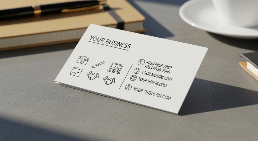
A business card should always contain your name, job title, and company name to establish credibility. Contact details like phone number, email address, and website are crucial for follow-ups. Adding a logo helps strengthen brand recognition and makes your business card look professional. You may also include social media handles or a QR code for easy access to your portfolio. Keeping the design clean while including these essentials makes the business card both functional and attractive. These elements ensure it works as an effective networking tool.
How can I make my business card stand out?
A business card can stand out with unique design elements that reflect your personality or industry. You can use bold fonts, creative layouts, or high-quality materials to make an impact. Special finishes like embossing, foil stamping, or matte textures add a premium feel. Including full-page imagery or a self-portrait can also make the business card memorable, especially for creatives. The key is balancing creativity with professionalism so that it’s eye-catching but still practical. A standout business card helps you be remembered long after the first meeting.
Are digital business cards better than printed ones?
Digital business cards are becoming popular because they’re eco-friendly, cost-effective, and easy to update. You can share them instantly through email, QR codes, or apps without worrying about printing costs. However, printed business cards still carry a personal touch that digital versions can’t fully replace. Face-to-face interactions often feel more complete when you hand someone a physical business card. Many professionals use both versions to cover every networking situation. Combining them ensures your business card strategy is modern, flexible, and effective.
What is the best size for a business card?
The standard size for a business card is 3.5 x 2 inches, which fits easily into wallets and cardholders. This size works best because it’s convenient and widely recognized. Some professionals choose unique shapes, such as square or vertical layouts, to make their business card stand out. However, if the card is too big or oddly shaped, people may find it difficult to carry. A creative design can still fit within the standard size, ensuring practicality and memorability. The key is balancing uniqueness with usability in your business card.
How many business cards should I carry?
It’s always wise to carry at least 20–30 business cards with you at networking events or meetings. Opportunities often come unexpectedly, and being prepared shows professionalism. Running out of business cards in front of potential clients can look unprepared. Keeping a stack in your wallet, bag, or car ensures you never miss a chance to share your details. If you attend large conferences, carrying 50 or more business cards is ideal. The goal is to always be ready to make connections.
Can I design my own business card or should I hire a professional?
Designing your own business card is possible with online tools like Canva or Vistaprint, which offer templates and customization. This is a budget-friendly option for startups or freelancers. However, if you want a truly unique or premium look, hiring a professional designer may be better. A designer can create a business card that perfectly aligns with your brand identity and industry standards. It depends on your budget and the impression you want to make. Either way, the design of your business card should always reflect professionalism.